You are using an out of date browser. It may not display this or other websites correctly.
You should upgrade or use an alternative browser.
You should upgrade or use an alternative browser.
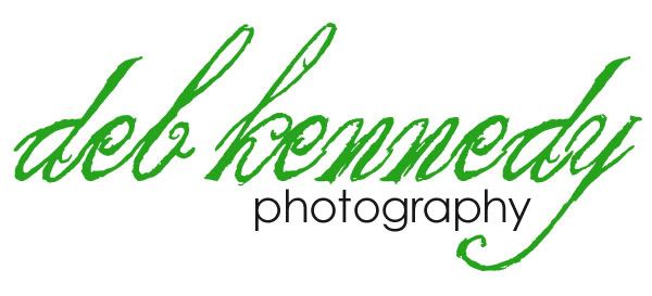
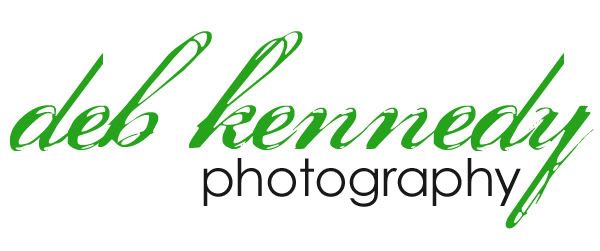
Photography logo
- Thread starter digideb
- Start date
lauren grier
you're like stars
I like b ")
jessica31876
New member
I like C
ColleenSwerb
Brodo gettin her Swerb on
I like c, but with a different font. Less jagged-y, kwim?
This is what I came up with as a copyright watermark for myself, and will turn into a logo should I ever need one (albeit with my married name, not my maiden name).

This is what I came up with as a copyright watermark for myself, and will turn into a logo should I ever need one (albeit with my married name, not my maiden name).
scarletsierra
New member
I think B is the easiet to read and it has a bit of funkyness to it so that's cool. But I think I'd like a best if it wasn't as "jaggedy"?
ditzyscrap
New member
I like b...a seems hard to read and the font used in c is used a LOT in logos and such...
LenaGardner
New member
is C the hurrican font? i really like it. I voted c
jessica31876
New member
OK gonna chaange mine I didnt see the poll above...I like c the best out of thee three but I do think something different would be better. I like hte style of B but I think the white space and being so big makes me not like it. The jaggedness of the first doesnt look that great and C is used alot but to me it looks the most professional.
lizzyfizzy
New member
i voted 'b'. i like the funky feel of it!
lauren grier
you're like stars
I like b...a seems hard to read and the font used in c is used a LOT in logos and such...
this
mummytothree
New member
I voted B Deb because it's fun and funky and bubble and that's what I think of when you post and I see your smiling avaie...a sweet, fun, bubbly girl!!!
ColleenSwerb
Brodo gettin her Swerb on
I voted B Deb because it's fun and funky and bubble and that's what I think of when you post and I see your smiling avaie...a sweet, fun, bubbly girl!!!
You totally made me change my mind! That's so true!!
I vote B!!

Aw! :wub:I voted B Deb because it's fun and funky and bubble and that's what I think of when you post and I see your smiling avaie...a sweet, fun, bubbly girl!!!
I love all 3 of them. I agree that A is a little harder to read than the others. B is definitely more "me" & that's whey I made that one! And then C is more professional, but still not boring...well, at least I don't think so! lol I don't think I've ever seen C used in a logo anywhere! I wanted something that you don't see often!
 If y'all have any font suggestions, please feel free to show me! :thumbup:
mommy2aria06
New member
B!!
scarletsierra
New member
The more I look at them, the more "b" appeals to me.
let me go get links for ya!I like B but voted for C. What fonts did you use on all 3? I likey them!
A: The King & Queen
B: Clementine Sketch
C: Porcelain
Thanks Deb!! :wub:
wildblueeyez
New member
I like B because it's easier to read than the other fonts