I think the problem is that the way they posted it and made the graphic made it look like they were to go together but if we looked at them disregarding one from the other then we might think differently. But everyone should wear what they like and feel comfortable in. So if these are not your shade, that is totally OK.
As far as a
shade when it comes to a color, what happens in industries around the world is that pantone will post the color with it's formula to get the exact color but it doesn't mean that industry designers will make things that exact same pigmentation if they don't choose to. Oftentimes it is off (darker, lighter, a little more saturation, a little less saturation), otherwise it would be really boring. Designers, in their design process, will look at different materials of the same general shade but not all will be an exact pigmentation from the other because of the way they are made, the materials, etc. Also, the color of the year is selected from emerging color trends, it has to resonate around the world, to express in color what is taking place globally. It has to have symbolism. By the time Spring rolled around this year, experts from different industries were gathered in a two-day secret Pantone meeting and 2016's colors were chosen.
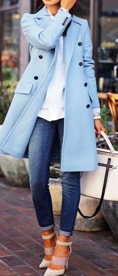
For example, this outfit using this coat was posted in 2014, which in my opinion resembles the blue on top. Is it exact? No, but I would totally rock this coat in 2016 and whenever.