

|
#1
 05-09-2010, 12:40 PM
|
||||
|
||||
|
Hey all, I'm doing a "persuasive" message for my last project in my communications class and the assignment was to pick a stance on an issue and create a visual message stating your stance similar to a magazine ad. I chose an anti-processed foods stance and this is the visual I created for it:
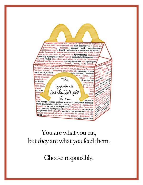 I just need a few reactions to the piece..does it get it's point across effectively, if you were flipping pages in a magazine, would it cause you to stop and look? Any other thoughts you have...thanks!!!! 
|


|
#2
05-09-2010, 12:43 PM
|
|||
|
|||
|
Oh my goodness. The ingredients really do fill the box?! I am shocked. So yes it would have stopped me in my tracks. Wow!!
Great job
__________________

|

|
#3
05-09-2010, 12:51 PM
|
||||
|
||||
|
If I saw that in a magazine, I would have stopped to really read it. It's great. I'm big on whole & natural foods because of our many food allergies so I may not be the target audience, but it's definitely eye-catching!
Great job!
__________________
|

|
#4
05-09-2010, 12:51 PM
|
||||
|
||||
|
I love it! Just wondering if a bolder/simpler font would be better for the cursive you have under the frown? It isn't as easy to read when flipping through a mag as a more simple font, yk?
|


|
#5
05-09-2010, 12:54 PM
|
||||
|
||||
|
I definitely think it gets the point across and love the slogan that you used. Is the skewed perspective on the box on purpose? It really stood out to me as being a little weird and the text around the frowny smile looks messy sloppy to me (maybe have it go all the way and place under the frown and just leave the inside area plain or??? have the text outlined and over the ingredients list? Not sure how clear I'm being...but the idea of it is wonderful, it would definitely catch my attention.
|

|
#6
05-09-2010, 12:55 PM
|
||||
|
||||
|
Quote:

|


|
#8
05-09-2010, 12:58 PM
|
||||
|
||||
|
Wow. Yes. Definitely would get my attention and the point is very clear. Makes me not wanna let my kiddo have McD's again that's for sure. And I love the sad face you created. I do agree about the font though, I think a bold print font would be more effective and eye catching.
__________________

|

|
#9
05-09-2010, 01:11 PM
|
||||
|
||||
|
Ok since 2 of you feel it would be better with a different font, I have this option for you to consider too! LOL
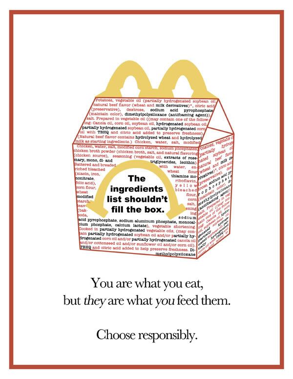 ETA: the reason I wanted the more subtle script was because it wasn't supposed to be the main message, KWIM? I think now, it definitely is the main message...is that better?
|
|
#12
05-09-2010, 01:16 PM
|
||||
|
||||
|
Wow! What a stunning and eye-catching ad! It would stop me in my tracks - I totally expect to see this on buses and billboards very soon!
My only input is using the word children or kids in your text instead of they - but maybe there is a specific reason not to do that?
__________________
|

|
#13
05-09-2010, 01:21 PM
|
||||
|
||||
|
Quote:
Thanks!! I didn't put "children" in place of they because the visual is that of a "happy meal" rather than that of just the McDonald's logo so it already implies children, kwim? Great input though, I'll totally have to consider that!
|
|
#14
05-09-2010, 01:25 PM
|
||||
|
||||
|
the message comes across. The font thing... maybe a script font that isn't cursive or loopy. The best description I can come up with is DJB The Libster
|

|
#15
05-09-2010, 01:26 PM
|
||||
|
||||
|
I think you did a fantastic job! Definitely got my attention and is a really good ad!
 I thought the scripty font worked - it just needed to be a scripty font that was a *little* easier to read. The large, bold, plain font takes away from the main message at the bottom, imo.
|
![[michele]'s Avatar](image.php?s=b84bb482e81b1ea127dd76832aee3834&u=2815&dateline=1267168749)
|
#16
05-09-2010, 01:29 PM
|
||||
|
||||
|
I'm wondering if perhaps the "web sized" version vs. the 8.5x11 printed version of that font is what's causing the problems because on the printed version I showed to people in person, no one had a hard time reading it so I'm wondering if it's just because it's so small on here? hmms...
|

|
#18
05-09-2010, 01:44 PM
|
||||
|
||||
|
I think its a good message
I would fix the perspective on the box and text and maybe do a text path around the frown so that its all justified and eliminate the white spaces? great idea!
|

|
#19
05-09-2010, 01:45 PM
|
||||
|
||||
|
The bold font pops out more but I agree it's a little "preachy" -- either way it Grabs my attention
__________________
|


|
#20
05-09-2010, 01:49 PM
|
||||
|
||||
|
if you are curious about a MAN's POV - he said he'd go somewhere in the middle on the font ... not as subtle as first, not as bold as last -- but either way --- he wouldnt care and he wouldnt stop to look
 hahah Hmm... does that helps you?!
__________________
|

|
#22
05-09-2010, 04:10 PM
|
||||
|
||||
|
IMO... It's more professional than most ads out there! I personally like the bold in your face font. It's an important message that too often gets pushed aside.... I'd stop to look at the add with the bold font, then the scripted.
__________________

|

|
#23
05-09-2010, 04:14 PM
|
||||
|
||||
|
WOW awesome ad! As the font, something less bold will be better
__________________
|


|
#24
05-09-2010, 04:23 PM
|
||||
|
||||
|
wooow. I love it! You rocked that Traci! I'd maybe go with a scripty print, rather than a cursive script, but other than that, its perfect!
__________________

|


|
#26
05-09-2010, 07:41 PM
|
||||
|
||||
|
I would stop and read it. I've been trying to get better about what I feed my kids so I understand this. I do agree it is the parents choice specially when they are little. Sometimes we let our lives run us and go the easy route such as McD's. Sometimes we have to step up and make time to do what is right.
__________________
Brittney
|

|
#27
05-09-2010, 07:48 PM
|
||||
|
||||
|
Traci, it's fabulous. I like the script over the more block style too. The only other suggestion I have is to remove the word but.
You are what you eat. They are what you feed them. Choose Responsibly. I was taught in some class many moons ago that the word but is a negation operator. In essence, it negates or lessons what you said before it. Just a thought.
|

|
#28
05-09-2010, 08:38 PM
|
||||
|
||||
|
WOW
LOVE the message - Great idea and AWESOME presentation!
|

|
#29
05-09-2010, 08:42 PM
|
||||
|
||||
|
Traci, I didn't like the script font...it got lost amongst the other writing on the box. The bold is much better and drives home the message. I guess to me, the point of the ad is to get people to think about what they are feeding their children.....no need to be nice about with cutesy scripty font. You want to slap them in the face and say, HELLO......this shit is killing your kids!
Just my two cents.
__________________
Susan
|

|
#30
05-09-2010, 09:15 PM
|
||||
|
||||
|
Love it and I would definately stop and pay attention to an ad like this.
|


|
#31
05-09-2010, 09:28 PM
|
||||
|
||||
|
I think it's creative and very powerful. I'd stop and read it, and it would change my behavior. (We don't go to McDonald's that much, but the last couple of months have been busy and stressful and I haven't been feeding the kids as well as I like to. I'm resolving to be better!)
I agree with you that the main message should be the bottom one. I find that bit of text very persuasive, especially as 3 separate lines without the 'but.' I'd go with a scripty font that's a little less loopy. I don't think the difference in your real life and internet test group was the page size. I think it's what we do as scrappers that makes the difference. Moms less tuned into fonts would see the message and give you the feedback you asked for. But I'm betting that if you showed them 2 or 3 variations and asked which they liked best, it wouldn't be that script. Just my 2 cents.
__________________

|

|
#32
05-09-2010, 10:41 PM
|
||||
|
||||
|
This is brilliant Traci!! I agree, the point is received. Don't go to McDonalds. But, it doesn't say what the ad recommends instead. I guess I expect it to show the alternative.
Great work, hope you get an A!
|


|
#34
05-10-2010, 12:34 AM
|
||||
|
||||
|
Thanks ladies!!
|
 |
«
Previous Thread
|
Next Thread
»
 Linear Mode

|
|

All times are GMT -4. The time now is 01:07 PM.