I didn't exactely mean the theme, but the style of a kit. I realised it might be good to give an example.
This is a very versatile kit from La obviously meant to serve for the thanksgiving season as well.

And here is a layout by Gemma, showcasing it perfectly in my eyes:
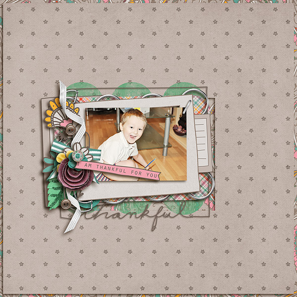
Even without the thankful paper strip I coulds instantly tell the feel of the kit. I can tell it has a mix of realistic and doodled elements. I can tell it has soft colours together with a crafty grey shade. I can see it includes one of La's famous journal mats, even if it's not used for journaling here. I also see it has enough variety in the elements like flowers and buttons. And that prominently placed glittering paper rose might just sell the kit to me. It all says feminine, soft with a touch of crafty.
To me as a customer that's what I expect from CT pages. I like the look of a page, go to the shop and find the kit's feel is exactely what I've seen on the layout. Then it's likely I'll buy it. When I see a layout that makes be wanna look at the kit for example because it's so whimsy and then kit is not, I will be slightly disappointed. I will admire the layout, but I wouldn't buy the kit unless it REALLY rocks in another way. It's not because that kit needs to be ugly to me, but mostly because it's not what I came looking for. So I will ignore it.