Quote:
Originally Posted by jacinda

You can turn a font into an alpha. Type your word then add an outside stroke to it, and a drop shadow. I usually separate the text and stroke into separate layers, then add a drop shadow to the stroke layer. Does that make sense? Then you can use any font you like for your title.
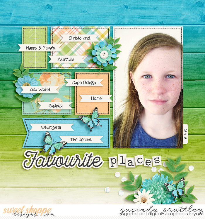
For example, on this layout I used a font for the word 'favourite'. Added an outside stroke and a dropshadow.
On this one (after separating the stroke and text layers) I added a small dropshadow to the text, and another dropshadow to the white outer stroke.

Alternately, if you don't have the ability to do a stroke, type each letter of your title on a separate layer. Using a chunky font would probably look best. Rotate/angle each letter so it looks a little crooked, then add a drop shadow. |
This is what I was thinking but wasn't sure if it was legal. Lol. Thank you
