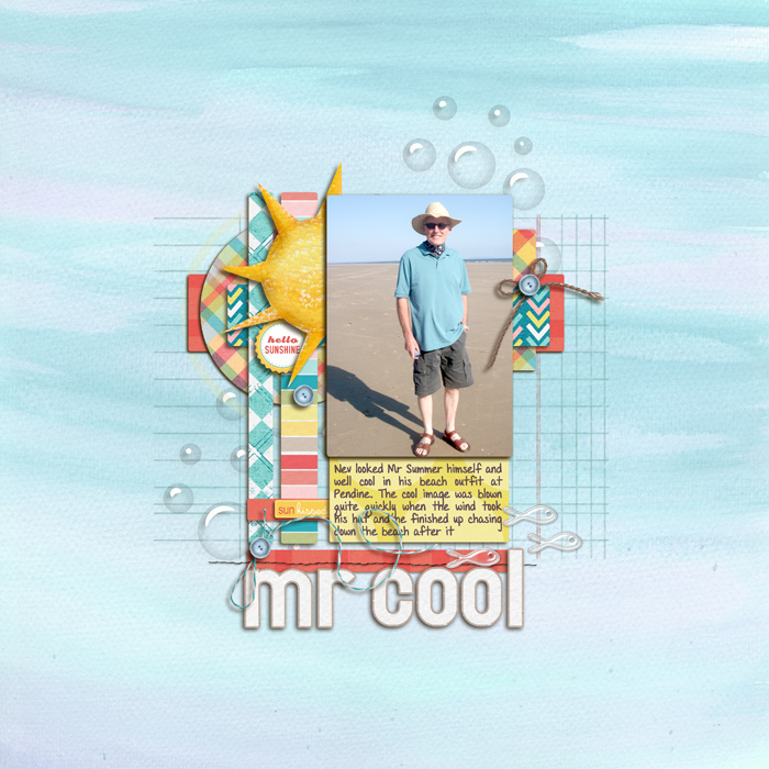
I love the composition here a lot. The blue background paper reflects the blue in the photograph perfectly and provides a great "white space". I like the rectangular look of your layout - the blocks, the overlayed graph paper, the title. Fresh and clean. Oh, and have I mentioned I like it?