Sweet Shoppe Community Sweet Shoppe Community |
|
|
|
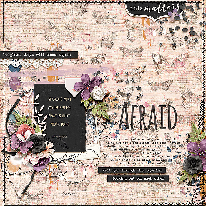
Afraid
 Photo Details
|
Leablahblah

Jabber-Jawbreaker
Registered: November 2013
Location: Baltimore, MD (origin: France)
Posts: 6,486

|
April Passport to Wellness
#18. Scraplift : Hosted on the Blog
Biancka's layout A Heavy Heart
https://www.sweetshoppecommunity.com...p?photo=575140
Kristin Cronin-Barrow & Studio Basic- Note to Self: Your Feelings Are Valid
If you're reading this, I would love some feedback on how to make my title better. Like blended into the paper maybe? I did "multiply" blend and opacity lowered a little bit but I don't like the result.
Is there a way to make any alpha look like a brushstroke? |
· Date: Tue April 14, 2020 · Views: 301
·
|
|
Additional Info
|
|
Additional Categories: Kristin Cronin-Barrow, Studio Basic Designs
|
|
|
Author
|
|
immaculeah

Sweet Talker
Registered: February 2007
Posts: 1,829
|
|
Tue April 14, 2020 5:55pm
|
|
|
Beautifully scrapped! I adore those lovely clusters and the pretty background paper you chose.
|
|

|
|
KingsQueen82

SugarBabe
Registered: May 2013
Location: Washington D.C.
Posts: 5,973
|
|
Wed April 15, 2020 8:43am
|
|
|
Very pretty Leah! I think we can all sympathize with what you're feeling right now! As far as the title, maybe you could add a tiny stroke to it or find a way to place a little bit of paint behind it just to pop it out a little bit. Another thought -- I think it's the single darker butterfly directly beneath it that's slightly distracting . What if you just made the background paper a little bigger and repositioned it so the title is sitting in the more pale butterfly that's currently above it instead? (I hope that makes sense?)
|
|
|
|
|
Neverland Scraps

Jabber-Jawbreaker
Registered: May 2008
Location: Ohio
Posts: 5,140
|
|
|
I love the emotion that you portrayed on this page, but not in scary colors, but more inviting and openess of talking about the fear of the pandemic. Beautiful page and composition!
I'm not sure, other than putting a style on it to look like a brush, instead of just a faded/blended typefont. Were you ever able to figure this out, since it's been a couple of weeks?
|
|
|
|
|
Powered by: PhotoPost PHP vB3 Enhanced
Copyright 2011 All Enthusiast, Inc.
All times are GMT -4. The time now is 01:02 PM.