Favorite Journaling Font?

I use Traveling Typewriter exclusively these days. I used to go through a long list of journaling fonts spending so much time finding the perfect font, but now I just use this one and another one for the date for readability and continuity from layout to layout. That font is Stamp and I use it for putting the date on my layouts if I'm not using a date product on my pages.
 
I use Traveling Typewriter exclusively these days. I used to go through a long list of journaling fonts spending so much time finding the perfect font, but now I just use this one and another one for the date for readability and continuity from layout to layout. That font is Stamp and I use it for putting the date on my layouts if I'm not using a date product on my pages.
OH! I LOVE that Stamp font. Thank you so much. I am off to download that one and the typewriter one, too. :D I do agree sometimes it's taxing to try and find the perfect font.
 
I just use my handwriting font that Darcy Baldwin made for me years ago. I will use others if I'm creating random pages, but our family albums I only use my handwriting.

But I love to see what everyone else uses! I actually don't love my handwriting, but I feel like I'm stuck now. LOL!
 
Ooooh, another Font Enabling Post - I love these! :love:

I wish I could do what @Cheryl Ashcraft has done and simply pick one and use it for everything. It sure would save me time ... but I love fonts, and I love how the change in typeface can totally change the mood of a layout, so I dig through my font manager every time...

I really like LiebeRuth and I'm using it for all my Faves layouts this year. It's totally readable yet still sort of whimsical.

If I want my journaling to feel sort of casual, I like Avelyn and Lovely Poetry.

But most times, I have way too many words for my available journaling space, so I find myself often reaching for Condensed typefaces. Some of my go-tos are Alt Gothic, Fort (the XCond version), MrEaves Narrow, American Type ITC Pro Cond.

I'm also a sucker for block handwriting that looks like old-style draftsman or architect print. For this, I love Snatched and Graphite or when I want something a little messy, Taxpayer.
 
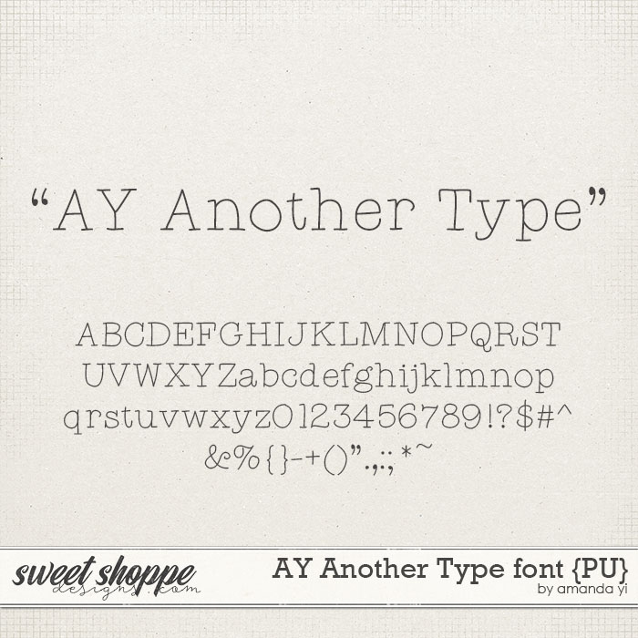
I will swap and change fonts depending on the feel I'm going for, but I do tend to use Amanda's fonts a lot. My current fave, because it's tidy and easy to read, is AY Nice and Neat. Soooo much better than my own handwriting.

ayi-pu-fonts-niceandneat-preview.jpg


I tend to use Problem Secretary quite a bit or even Yanks hand if I want a handwriting type of font. Black Chancery is another one I'll use. Traveling Typewriter is used for those layouts that I just put a date on (like my October Daily project).
 
I tend to use Problem Secretary quite a bit or even Yanks hand if I want a handwriting type of font. Black Chancery is another one I'll use. Traveling Typewriter is used for those layouts that I just put a date on (like my October Daily project).
Oh, those are fun! Problem Secretary is just the right amount of imperfect, and I am completely in love with Yanks Hand! Those a's with the ascender and large x-height (I think that's the right term?) make me soooo happy...!
 
Back
Top