

|
#1
 01-25-2025, 01:28 PM
|
||||
|
||||
|
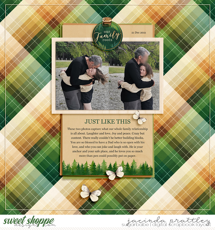
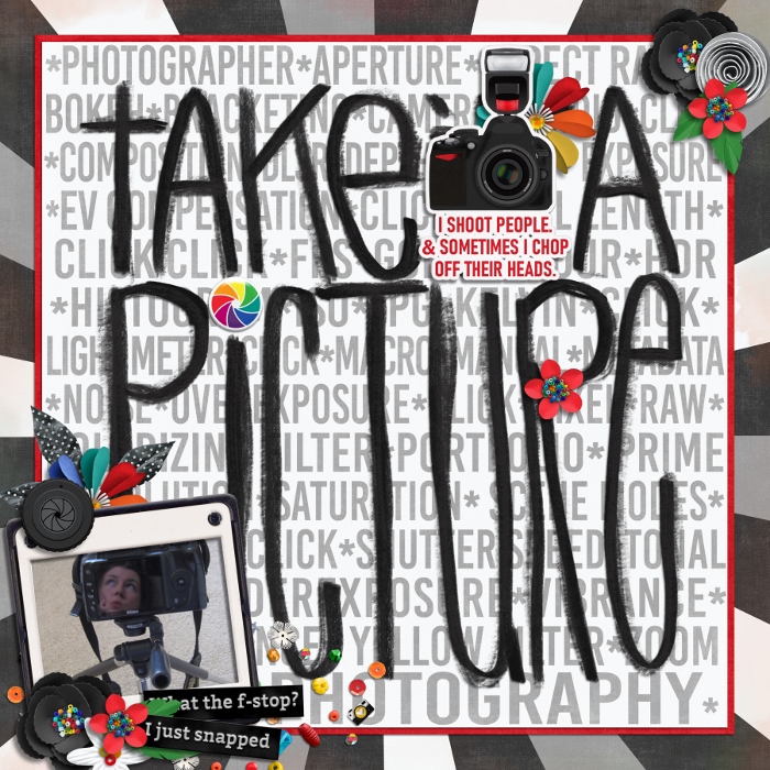
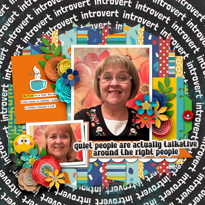
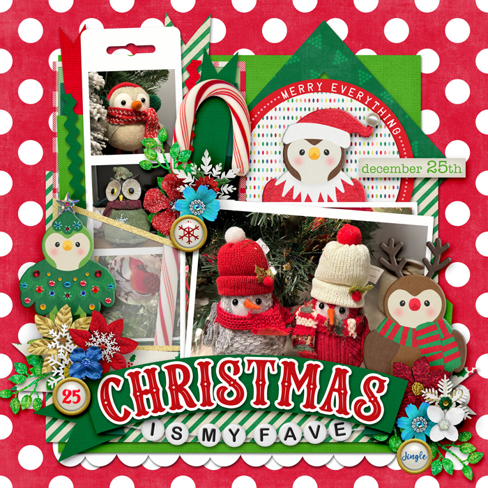
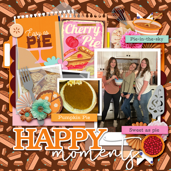
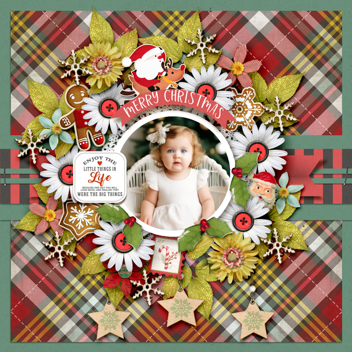
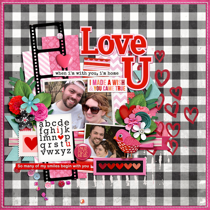
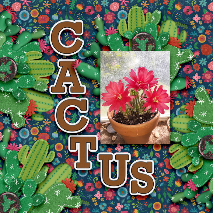
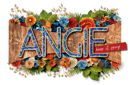
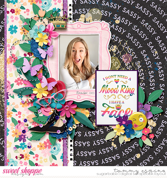
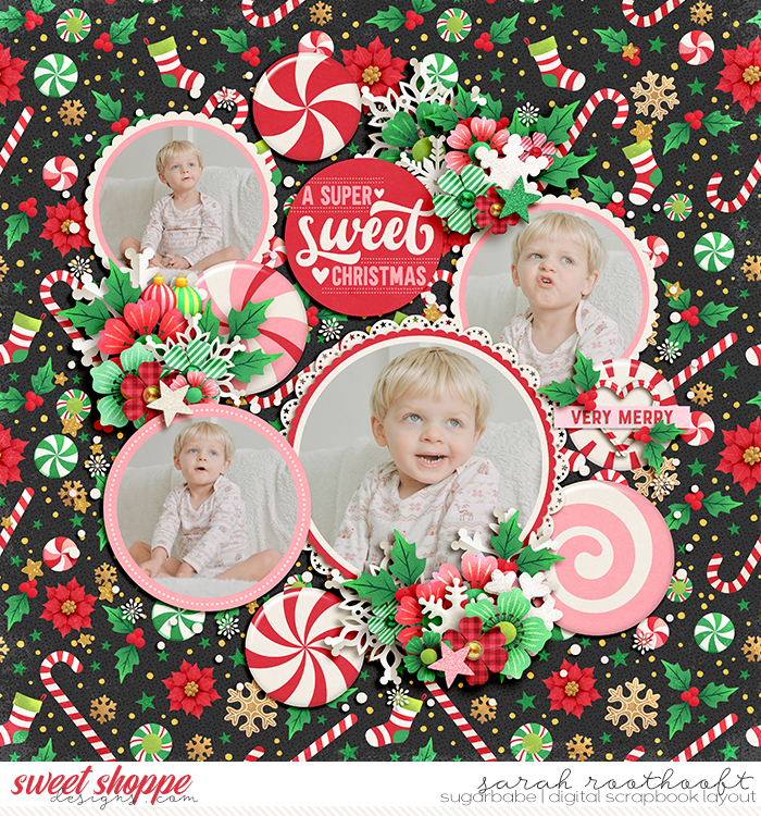
I just released I LOVE YOU MORE and it does contain one very bold pattern. Since I know many are afraid of bold patterns, I thought I'd provide some thoughts on using them. If you have further ideas add on to the thread!
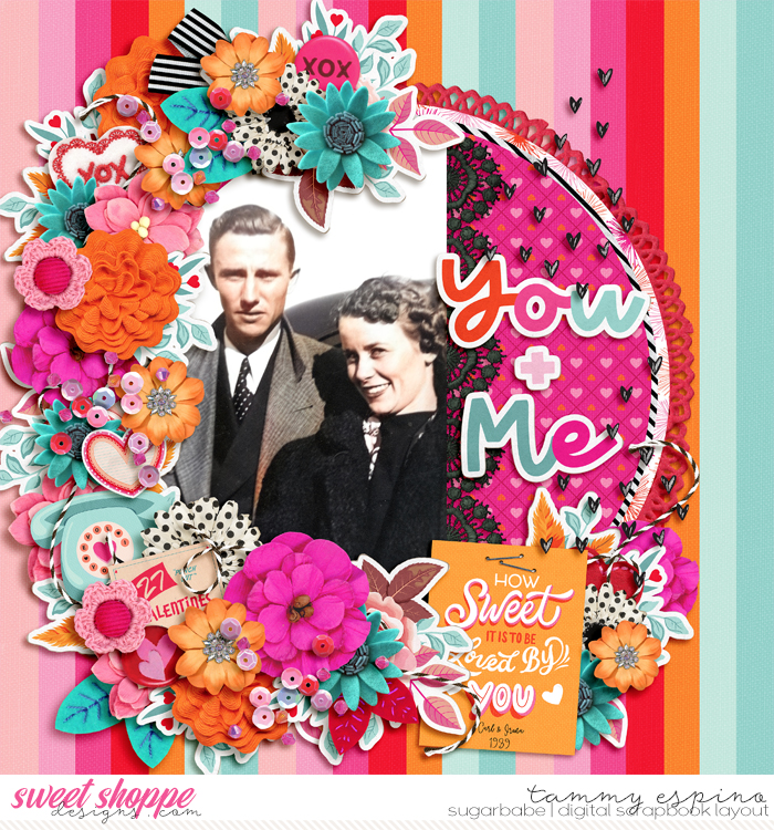
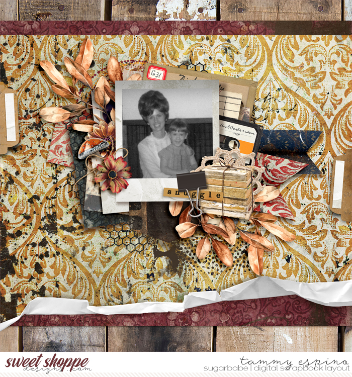
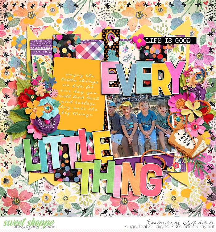
Using Bold Patterns on your Scrapbook Page Bold, less-busy photos work best if you really want to feature a bold paper you are in love with. Think photos that are more simple with minimal colors & background noise. Try to use a bold paper that matches some of your photo colors for continuity or you can turn your photo black & white. Personally I prefer a white frame or stroke around B&W photos to help them pop - too often I see them get lost in a layout. Another trick to helping the B&W photos pop more is placing a colorful word art in a blank spot on the photo or some other smaller color item like buttons, flowers, etc. Another way I get the photos to pop from a bold pattern is layering other papers, paint, ephemera, etc., under the photo and coming out just a bit from edges. You can use the bold paper you love by cutting it or tearing it digitally in strips or cut it in shapes so it's there but not the background feature. I have an old tear action that included a good brush for the torn look but many brushes can work great for that simply by adjusting their settings - angle, size, how close together the brush tip is when dragging it... You can pair a bold paper with a neutral or even neutral small-print paper - about 1/3 of your bold to 2/3 more neutral. Use that bold paper in the background but add something neutral in the foreground to place some of your layout on. If you are stacking papers, put the least busy on top. Another trick I use is to place bold paper about 2/3 of the way up my photos and a less bold paper on top. Usually I'll add a ribbon over the edge and maybe stitching. Surround your photo(s) with a whole bunch of cute stuff and it will pull the eye in from the beautiful bold paper. Or just embrace your inner boldness and go for the crazy bold! By the time you've looked at these you might spot a trend in my own scrapbooking pages - hint - it was one of the ideas I gave. You can see my full gallery under TraceyM 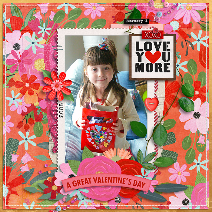      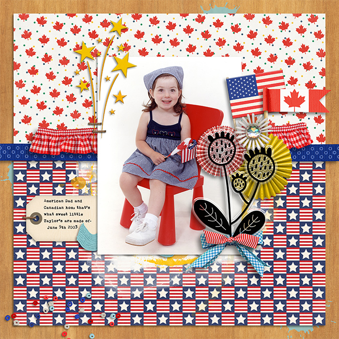  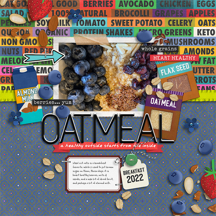 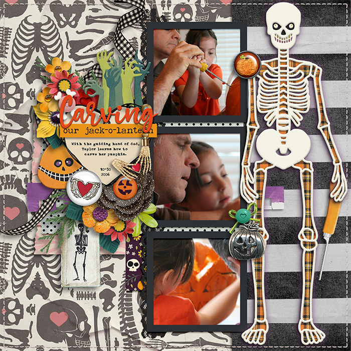 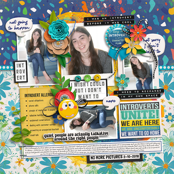 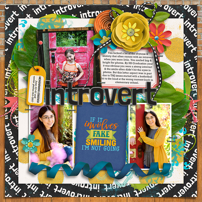 I may have broken some of my own rules/ideas on this one but still love it. The size of the photos made the bold enough. 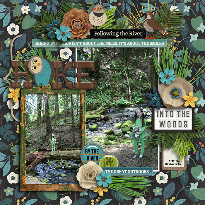
__________________
Last edited by TraceyM; 01-25-2025 at 01:32 PM. 
|


|
#2
01-25-2025, 01:37 PM
|
|||
|
|||
|
Great Ideas...Thanks!
|

|
#3
01-25-2025, 01:45 PM
|
||||
|
||||
|
Love this Tracey! Super great suggestions!!
__________________
|


|
#5
01-25-2025, 02:06 PM
|
||||
|
||||
|
While I'm a complete sucker for a good woodgrain background paper- I do love bold florals and wordy papers too! I'm just glad they are digital now- since I hated using my favorite papers as a paper scrapper- I didn't want to cut them up!

__________________

|

|
#6
01-25-2025, 02:12 PM
|
||||
|
||||
|
It is funny because as a designer the bold patterns like big florals are the ones we spend a lot of time on but they don't seem to get a lot of use LOL. Rubia and I were talking the other week about feeling sad for all our papers that are likely lost in a graveyard never to be opened haha.
These are great ideas, Tracey! Sarah recently did a spread using a floral and it was a treat to see! 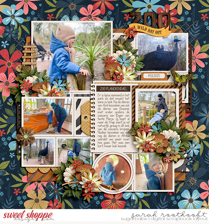 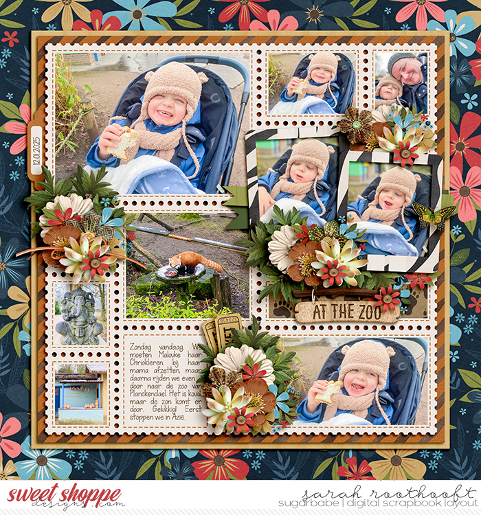 Everything worked so seamlessly.
|

|
#7
01-25-2025, 02:29 PM
|
||||
|
||||
|
I LOVE when bold papers are used as a background. With that said, I love them on others pages because on my own I tend to go more neutral. I need to learn to step outside my comfort zone and try being a bit more bold with my paper choices.
|


|
#8
01-25-2025, 02:34 PM
|
||||
|
||||
|
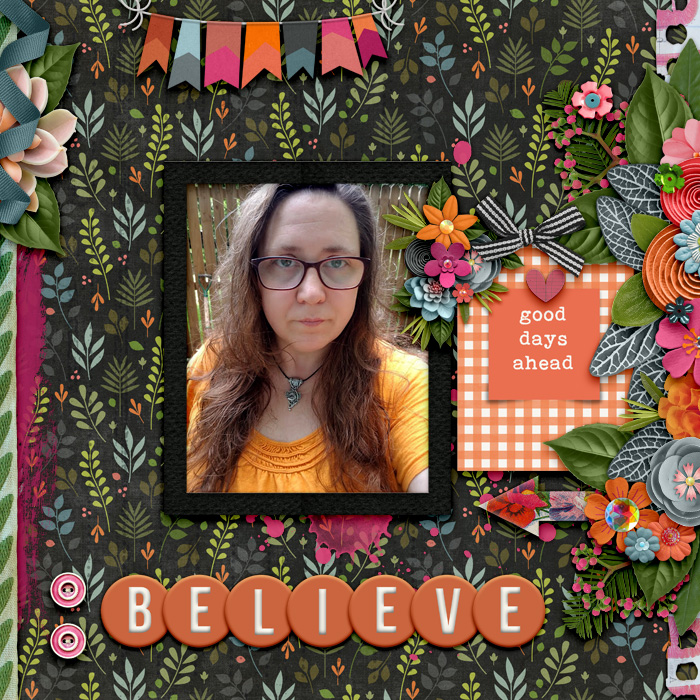
I'm one who likes a cleaner look on my pages, so although I adore all the pretty patterned papers, I tend to use solids more often than anything. When I do use a bold patterned paper, I place solids between my photos and the patterned paper. I feel this provides breathing room, and helps the photo to stand out. Then I have the best of both worlds!
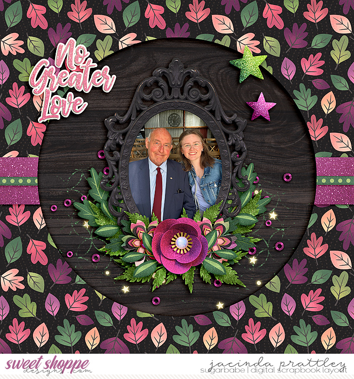   Or I just use a strip of the patterned paper. Having lots of solid paper on the page actually draws your eye to the patterned paper, making it the focus of your page. 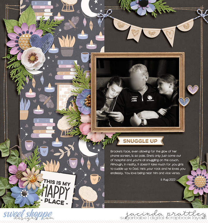
__________________
 Last edited by jacinda; 01-25-2025 at 02:38 PM.
|

|
#9
01-25-2025, 02:36 PM
|
||||
|
||||
|
Great tips, Tracey.
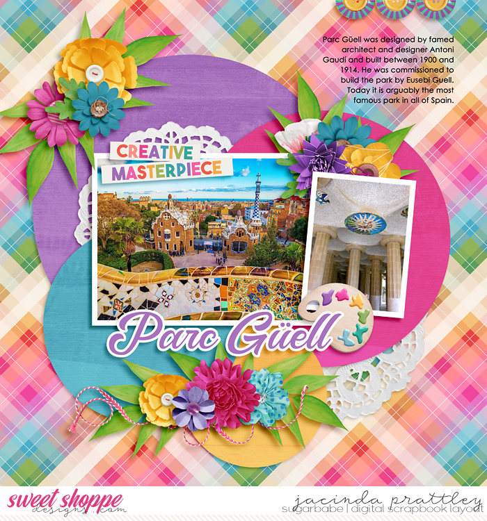
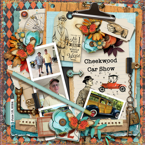
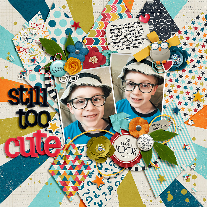
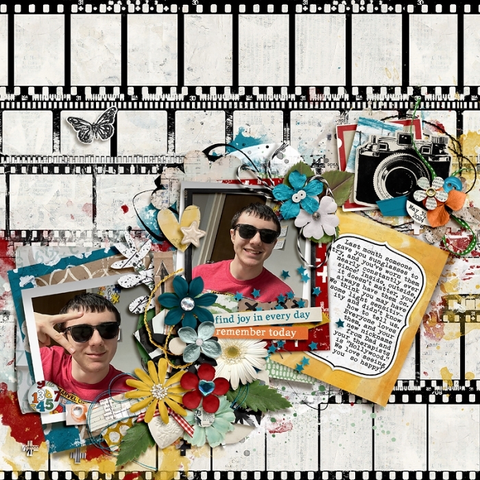
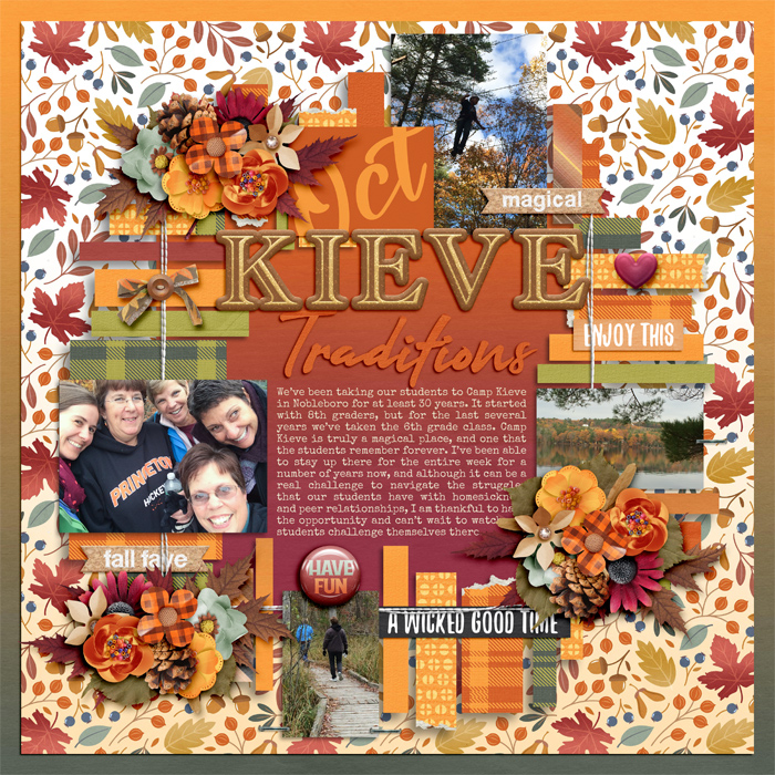
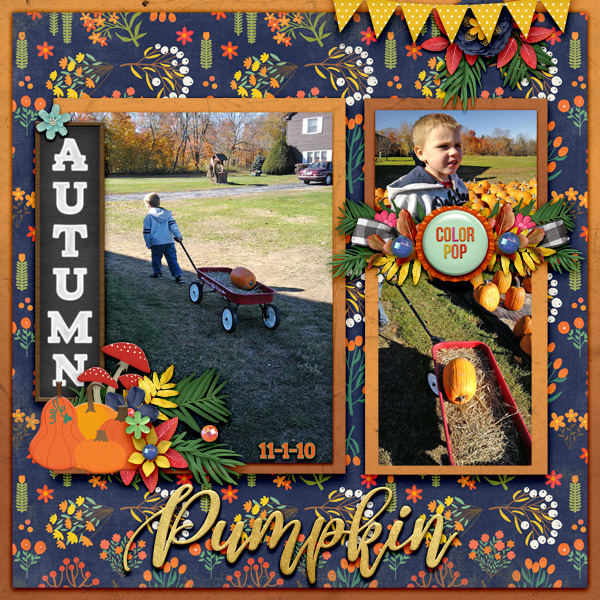
So... how big and how bold does it have to be to qualify?  I took a glance through my gallery and think I use those big, bold papers often. Well, I had 12 layouts on different opened tabs and decided not to look any further. lol Sometimes, they are peeking out behind other layers of papers as in a border. Do we count big dots/circles as big and bold? 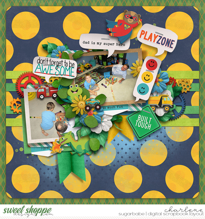 This one has a sort of big & bold paper in the back. 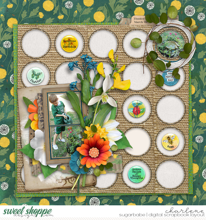 A few more: 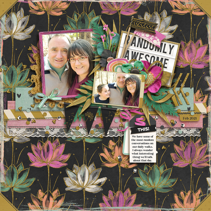 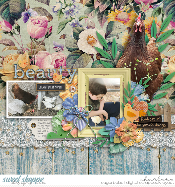 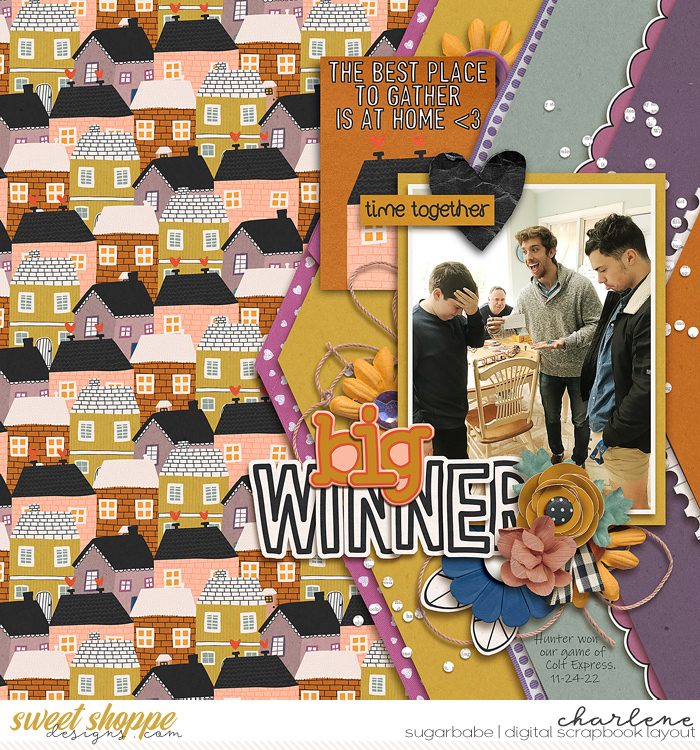 And, funny how my memory is awful with some things but sharp with others.  I immediately remembered a layout I saved to my favorites years ago from Leah. My comment to her at the time even included "love the full/large-patterned background..." lol I immediately remembered a layout I saved to my favorites years ago from Leah. My comment to her at the time even included "love the full/large-patterned background..." lol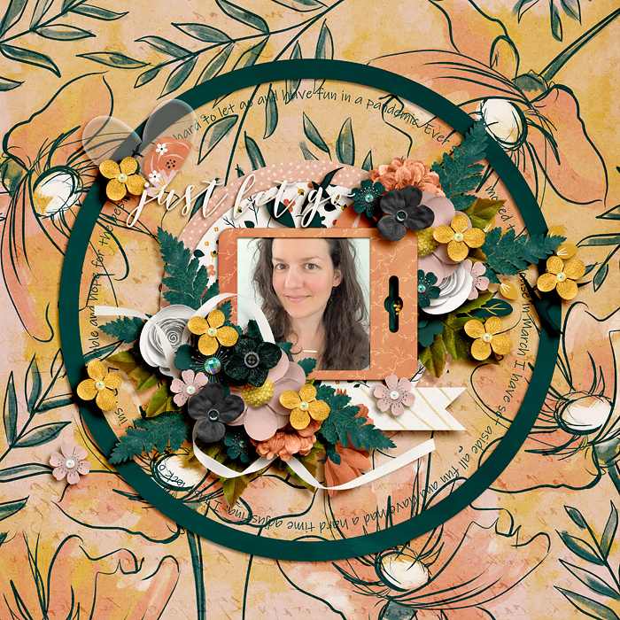
__________________

|

|
#10
01-25-2025, 03:44 PM
|
||||
|
||||
|
I so adore that you guys are sharing too! I think it helps all of us when we see how others do a specific concept. The paper graveyard of bold patterns should not exist as it does. LOL. I will try to do more posts like these that give how to's on various topics. I don't consider myself a perfect scrapper but like so many, I scrap for me.
Charlene, yes big dots are a bold paper. Jacinda, what you do is a version of one of my suggestions . Kristin, that paper is simply gorgeous and the sizing put it in the bold category. Sara's pages are always so pretty. Steph, another great example!
__________________
|
|
#11
01-25-2025, 05:09 PM
|
||||
|
||||
|
It's me, hi. I'm the problem, it's me
 The big patterns draw me in, I have literally bought kits because of THAT PAPER!! I LOVE the big patterns, I just can't seem to use them. I'm by no means a minimal scrapper, but I find myself using wood and neutrals on like 90% of my pages. I always find a way to use those gorgeous papers - but they are definitely tucked away  Thanks for the tricks. I LOVE all of the examples but unless it's part of a challenge *wink wink* it feels too far outside my comfort zone.
__________________

|

|
#12
01-25-2025, 05:37 PM
|
||||
|
||||
|
I go back in forth with the bold. Sometimes, I struggle with the bolder paper and will layer them with more solid options and sometimes they seem like the most obvious thing.
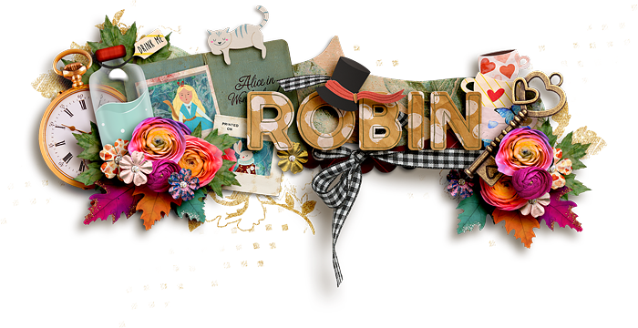
 This one, I paired a busier paper, with the black and white cat and bright colored paint. 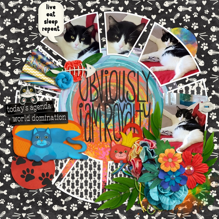 Sometimes, the page just NEEDS that boldness 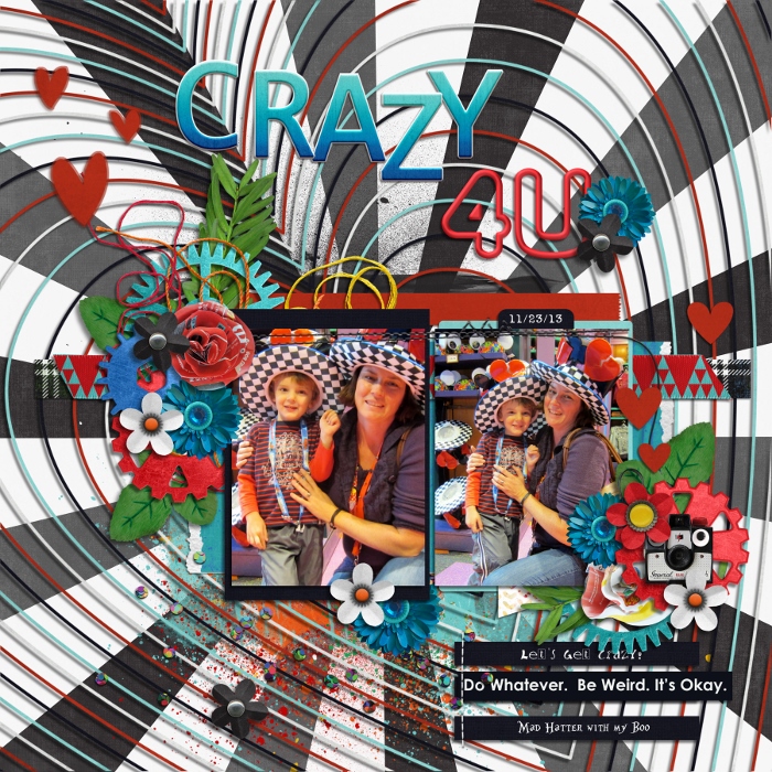 In this case, I used bold papers in small pieces, but all in the same color family. 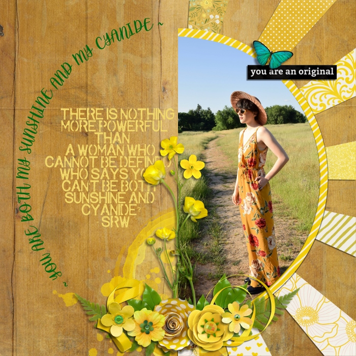
__________________
 Last edited by meagan43; 01-25-2025 at 05:40 PM.
|


|
#20
01-25-2025, 07:10 PM
|
||||
|
||||
|
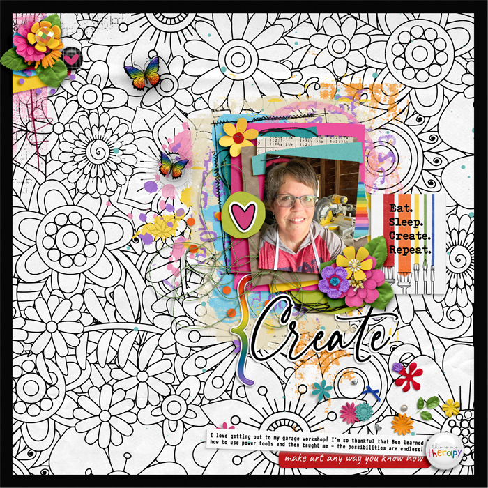
I love this post. I enjoy using blend modes on bold papers to get some different looks with them or one of my faves is to clip bold papers to paint for a splash of eye catching texture.
__________________
   
|

|
#21
01-25-2025, 07:15 PM
|
||||
|
||||
|
Quote:
Love all those big bold patterns but when I scrap I tend to chose the neutral papers or the most I do is big stripes paper. Thank you for the suggestion Tracey! 
__________________

|


|
#23
01-25-2025, 10:54 PM
|
||||
|
||||
|
Great tips! I definitely tend to get stuck in the white paper rut but every now and then I try to pull myself out of it lol.
__________________
      
|

|
#24
01-26-2025, 01:03 AM
|
||||
|
||||
|
Quote:
__________________
|
|
#25
01-26-2025, 02:44 AM
|
||||
|
||||
|
Those are some great suggestion, Tracey!
Your layouts are so beautiful! Thank you for showcasing two of my layouts, Kristin. Much appreciated. I LOVE floral background papers, I try to use them all the time as one of the layers in my layout. But almost never as the bottom background paper. If there are woodgrain papers in a kit, I will almost all of the time.
__________________

|

|
#26
01-26-2025, 09:46 AM
|
||||
|
||||
|
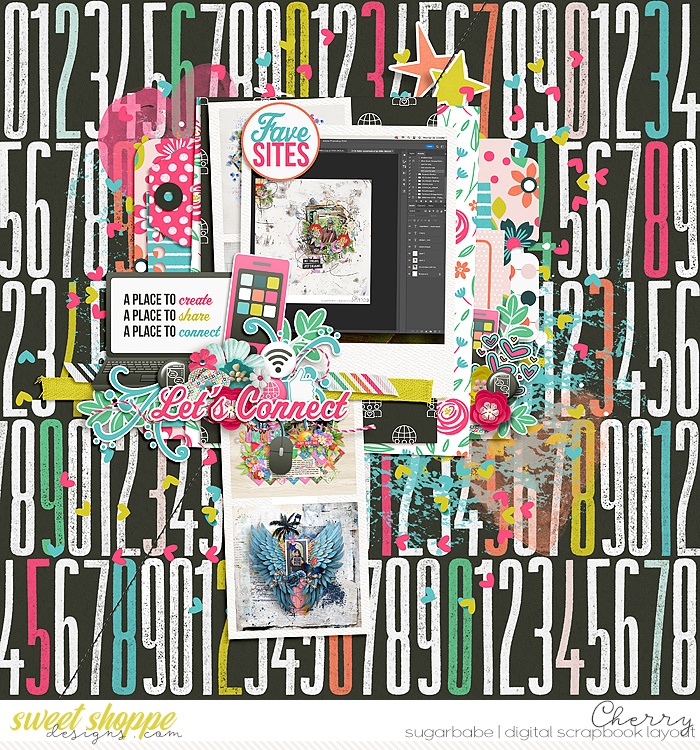
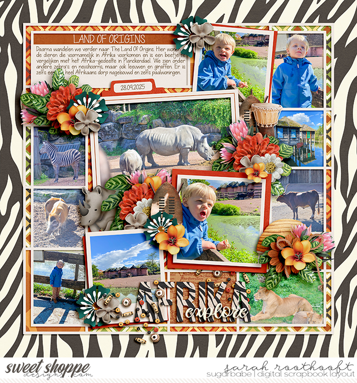
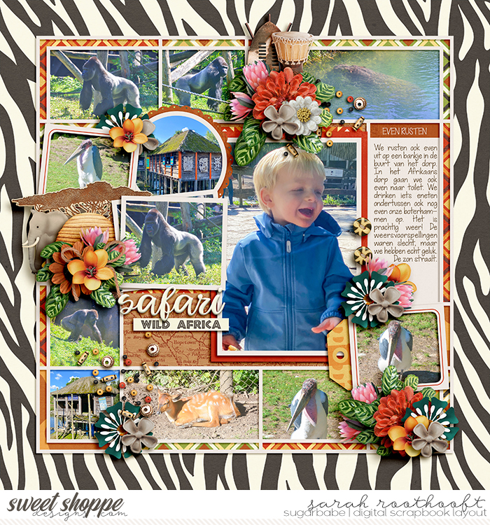
I LOVE bold papers and try to at least use them as accents. Here are a few of mine:
|


|
#28
01-26-2025, 04:02 PM
|
||||
|
||||
|
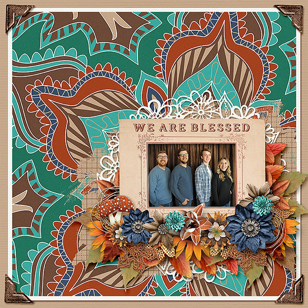
I don't have a lot of pages with bold background, but I found this:
__________________

|


|
#30
01-26-2025, 05:35 PM
|
||||
|
||||
|
Tracey, this is AMAZING - thank you so much for the professional advice! I'm guilty of falling in love with bold, patterned paper but then not knowing how to use it. I'll have to give this a try on my next layout. You rock!
|

|
#31
01-26-2025, 07:15 PM
|
||||
|
||||
|
Fantastic tips, Tracey! I LOVE using bold patterns.
|


|
#32
01-26-2025, 10:41 PM
|
||||
|
||||
|
I think this thread will help some just seeing all sorts of bolder papers in use in one spot. I could have pulled a lot more out of my personal gallery. LOL.
__________________
|


|
#35
01-27-2025, 05:11 AM
|
||||
|
||||
|
__________________
|


 |
«
Previous Thread
|
Next Thread
»
 Linear Mode

|
|

All times are GMT -4. The time now is 11:22 PM.