


|
#1
 01-25-2025, 01:28 PM
|
||||
|
||||
|
I just released I LOVE YOU MORE and it does contain one very bold pattern. Since I know many are afraid of bold patterns, I thought I'd provide some thoughts on using them. If you have further ideas add on to the thread!
Using Bold Patterns on your Scrapbook Page Bold, less-busy photos work best if you really want to feature a bold paper you are in love with. Think photos that are more simple with minimal colors & background noise. Try to use a bold paper that matches some of your photo colors for continuity or you can turn your photo black & white. Personally I prefer a white frame or stroke around B&W photos to help them pop - too often I see them get lost in a layout. Another trick to helping the B&W photos pop more is placing a colorful word art in a blank spot on the photo or some other smaller color item like buttons, flowers, etc. Another way I get the photos to pop from a bold pattern is layering other papers, paint, ephemera, etc., under the photo and coming out just a bit from edges. You can use the bold paper you love by cutting it or tearing it digitally in strips or cut it in shapes so it's there but not the background feature. I have an old tear action that included a good brush for the torn look but many brushes can work great for that simply by adjusting their settings - angle, size, how close together the brush tip is when dragging it... You can pair a bold paper with a neutral or even neutral small-print paper - about 1/3 of your bold to 2/3 more neutral. Use that bold paper in the background but add something neutral in the foreground to place some of your layout on. If you are stacking papers, put the least busy on top. Another trick I use is to place bold paper about 2/3 of the way up my photos and a less bold paper on top. Usually I'll add a ribbon over the edge and maybe stitching. Surround your photo(s) with a whole bunch of cute stuff and it will pull the eye in from the beautiful bold paper. Or just embrace your inner boldness and go for the crazy bold! By the time you've looked at these you might spot a trend in my own scrapbooking pages - hint - it was one of the ideas I gave. You can see my full gallery under TraceyM 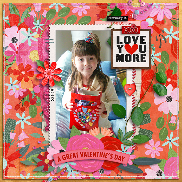      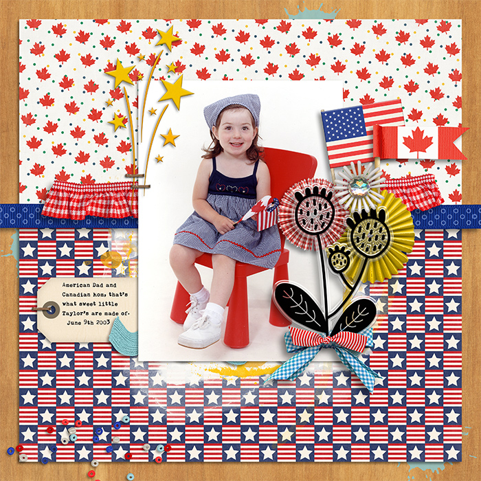  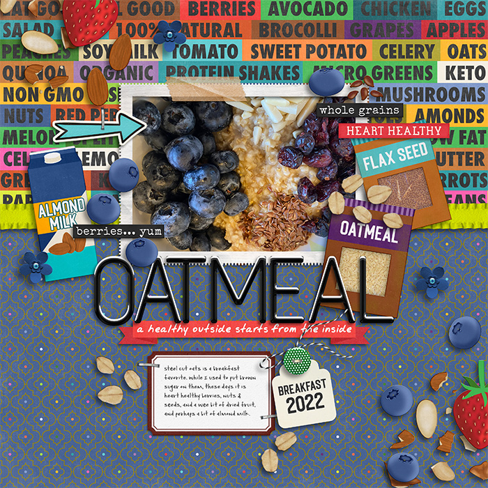 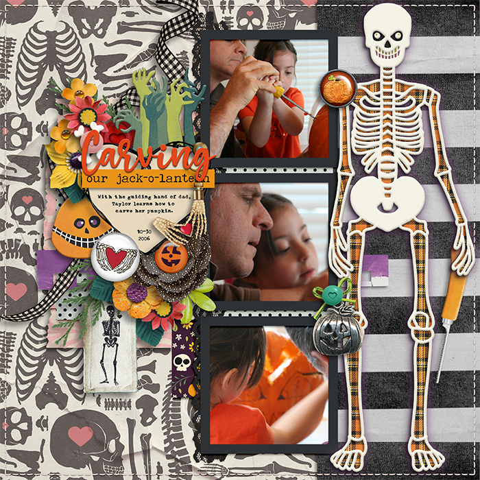 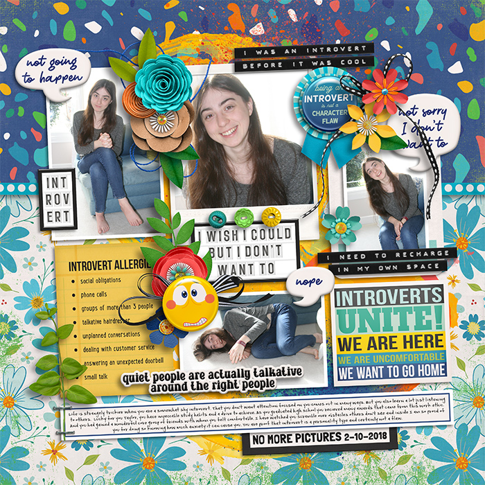 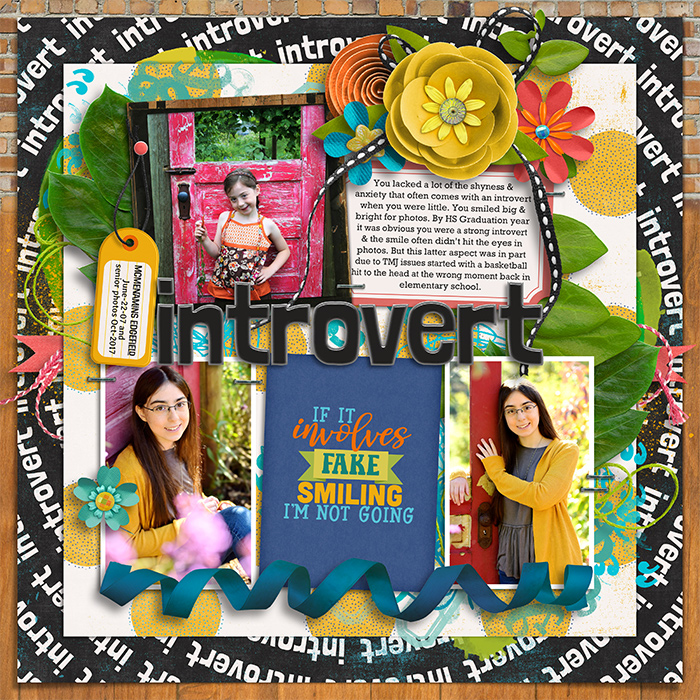 I may have broken some of my own rules/ideas on this one but still love it. The size of the photos made the bold enough. 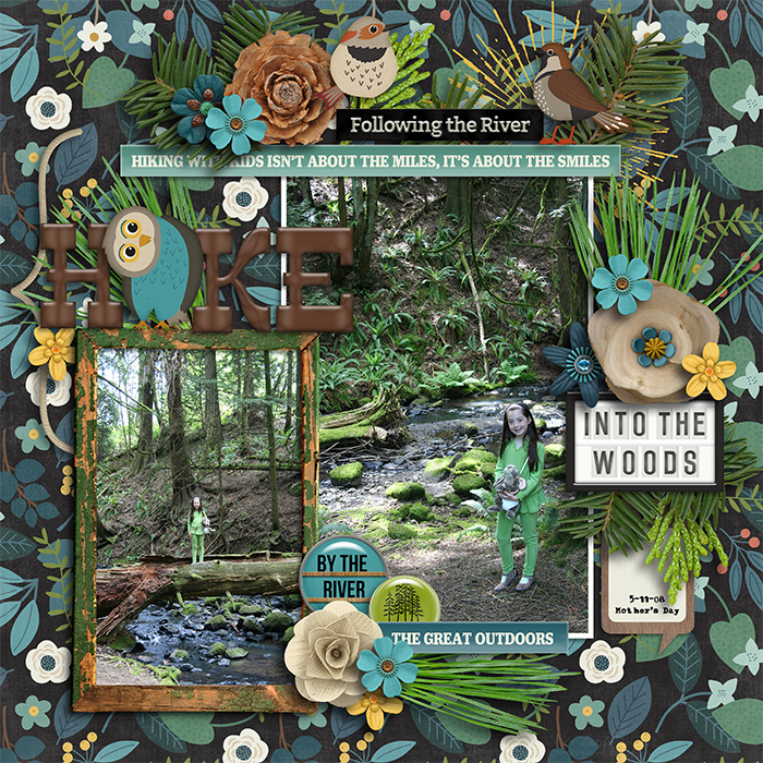
__________________
Last edited by TraceyM; 01-25-2025 at 01:32 PM. 
|


«
Previous Thread
|
Next Thread
»


 Threaded Mode
|
|

All times are GMT -4. The time now is 11:14 PM.