

|
#1
 09-09-2010, 04:25 PM
|
||||
|
||||
|
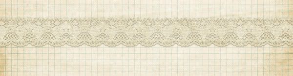
is desperately needed, lol! I'm trying to shadow the fine lace found in Julie's "Prairie Fields" kit:
 I just can't get it to look right though... everything I tried makes it so dark and heavy looking. Any tips on shadowing lace to make it look nice??
__________________
 Huge fan of:    
|


|
#2
09-09-2010, 04:42 PM
|
||||
|
||||
|
Not sure which program you use but you can try lowering the opacity and blending mode.
|


|
#4
09-09-2010, 05:14 PM
|
||||
|
||||
|
OK... depending on the paper you pick (I chose the graph - same kit) I set my shadow to 30% opacity at Linear Burn, distance 2, spread 0, and size 4.
__________________
|


|
#5
09-09-2010, 05:17 PM
|
||||
|
||||
|
Thanks ladies! My lace looks much nicer now!
__________________
Huge fan of:
|
|
#6
09-09-2010, 05:18 PM
|
||||
|
||||
|
Quote:
__________________
Huge fan of:
|

 |
«
Previous Thread
|
Next Thread
»
 Linear Mode

|
|

All times are GMT -4. The time now is 05:58 PM.